|
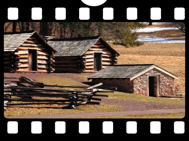
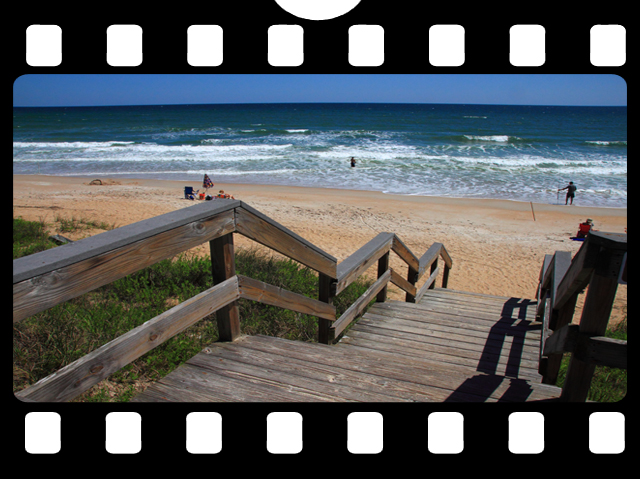
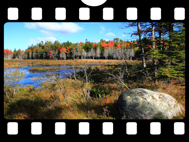
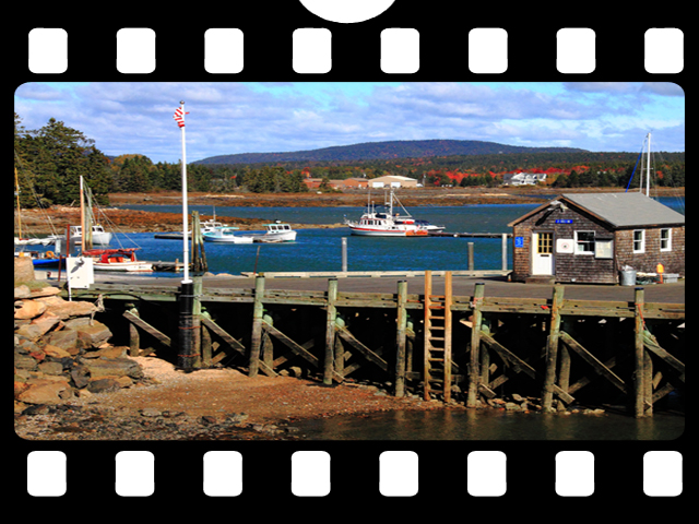
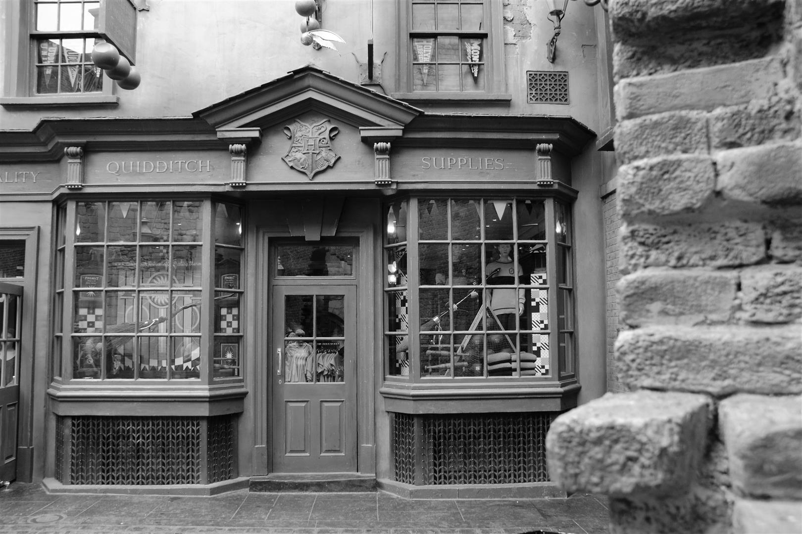
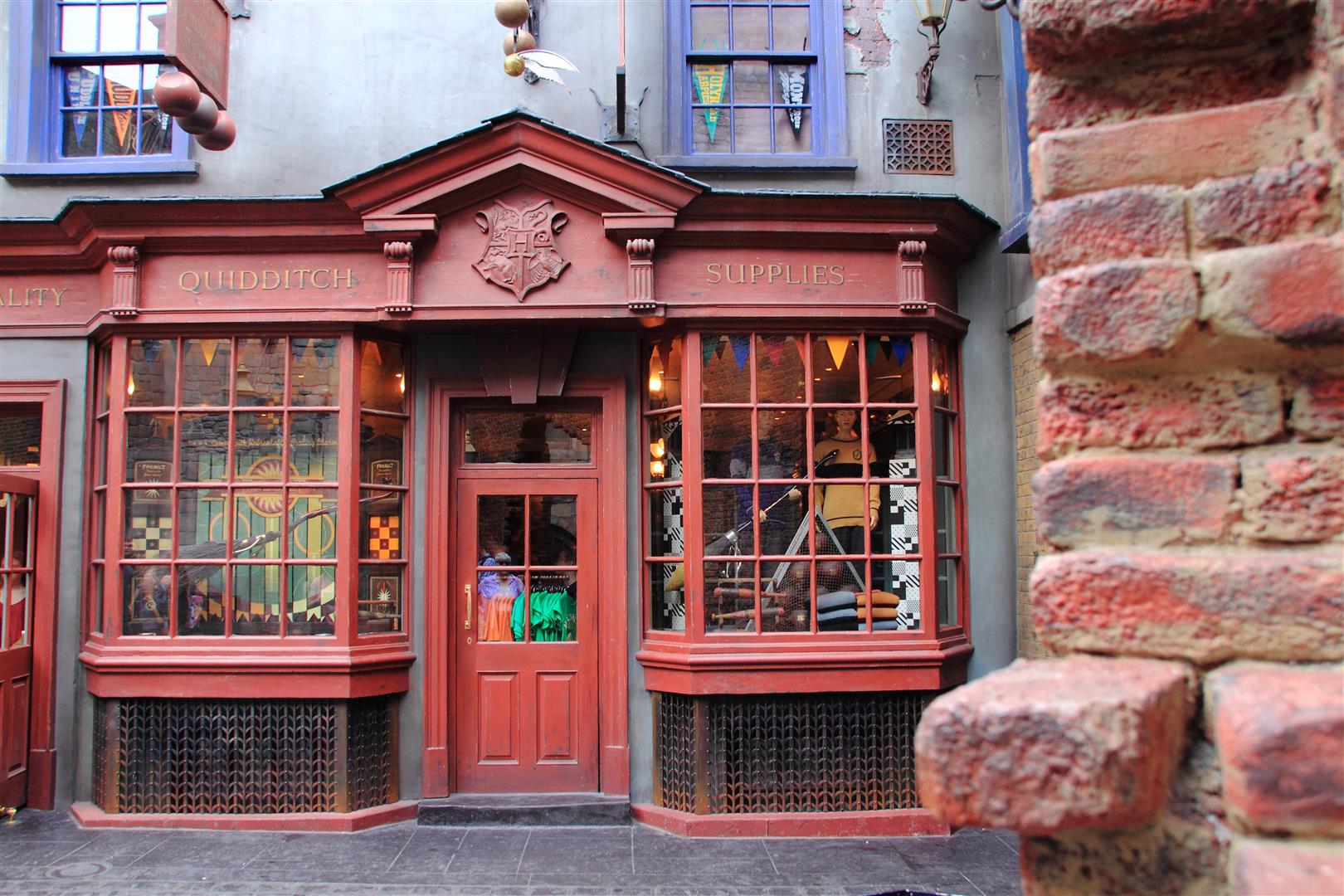
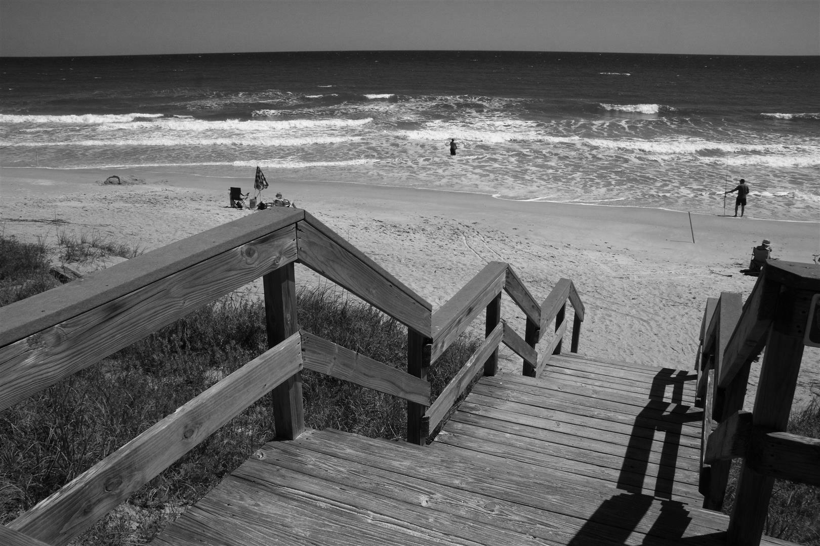
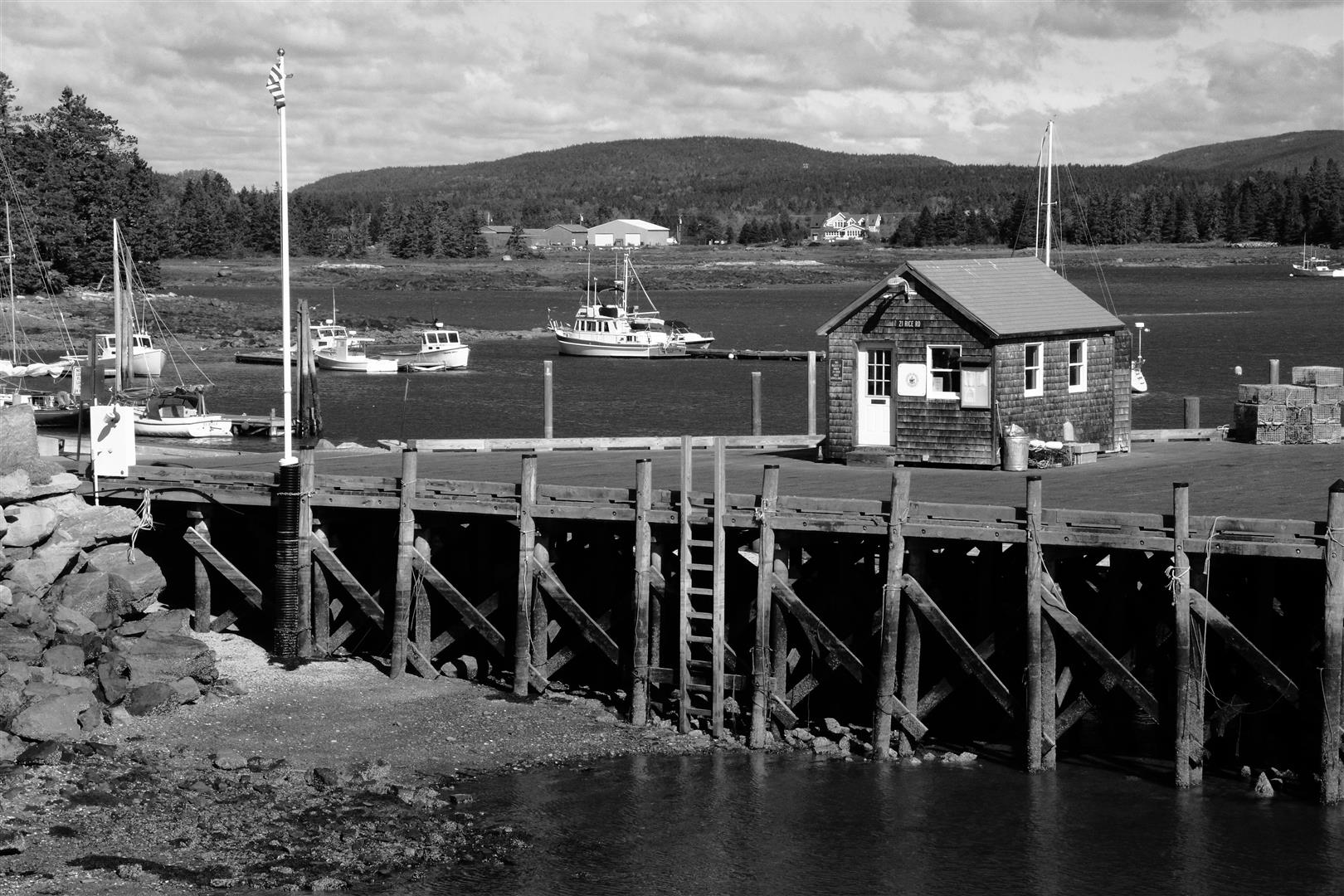
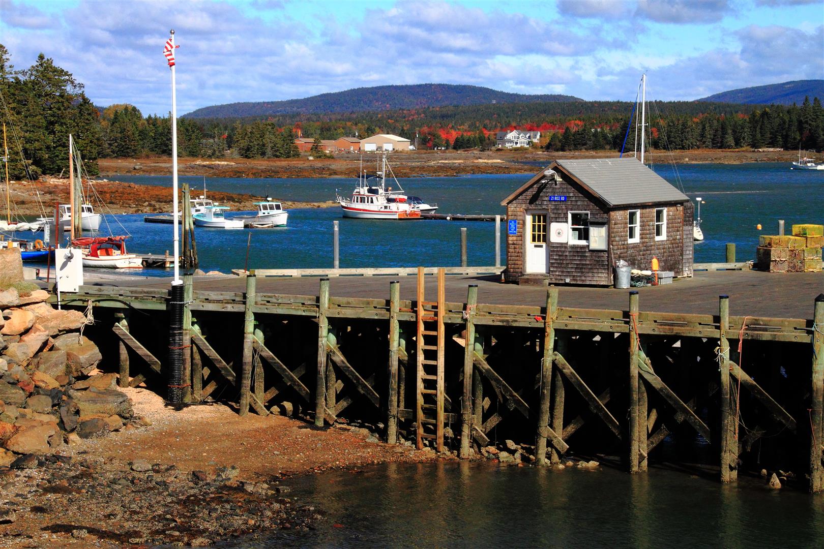
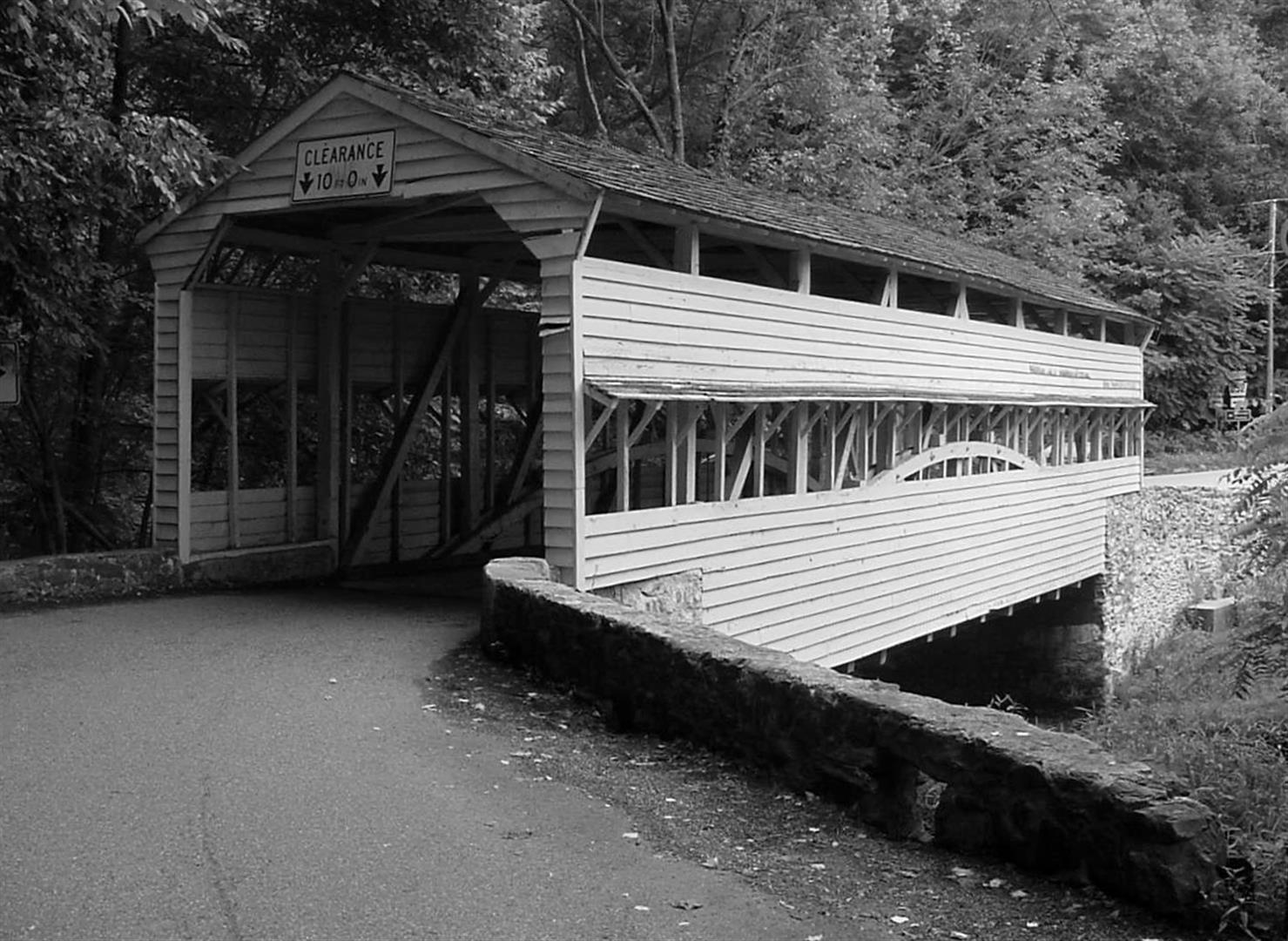
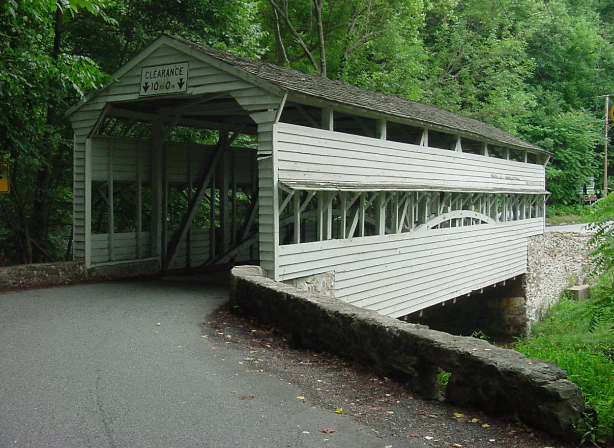
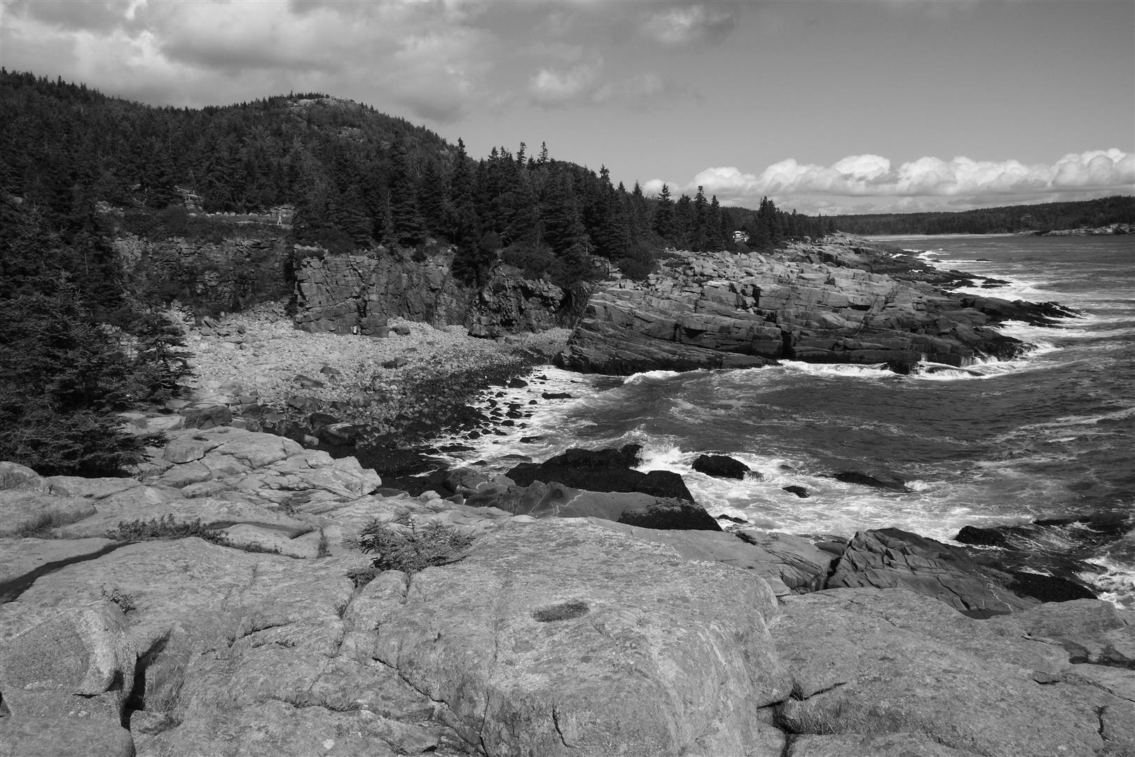
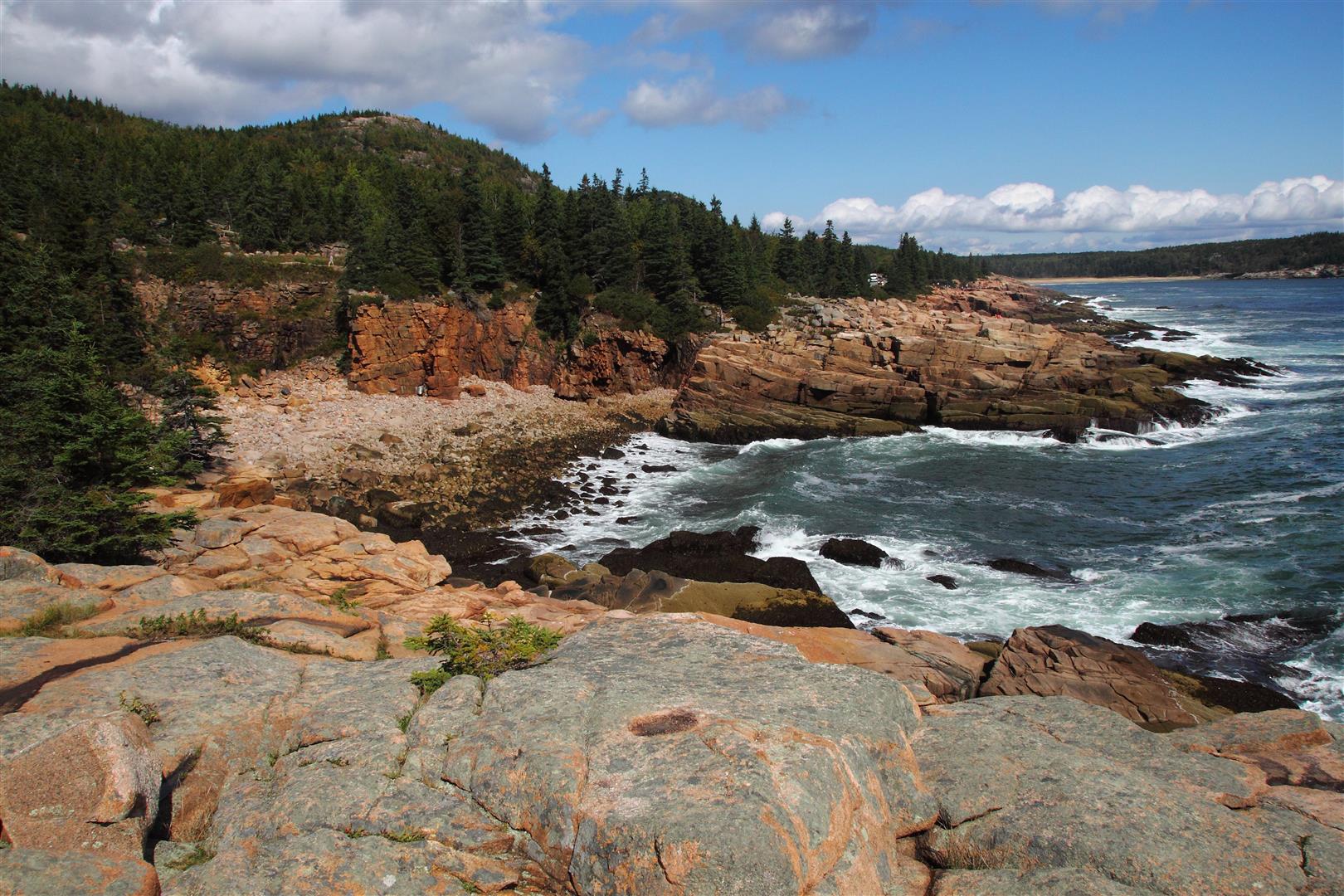
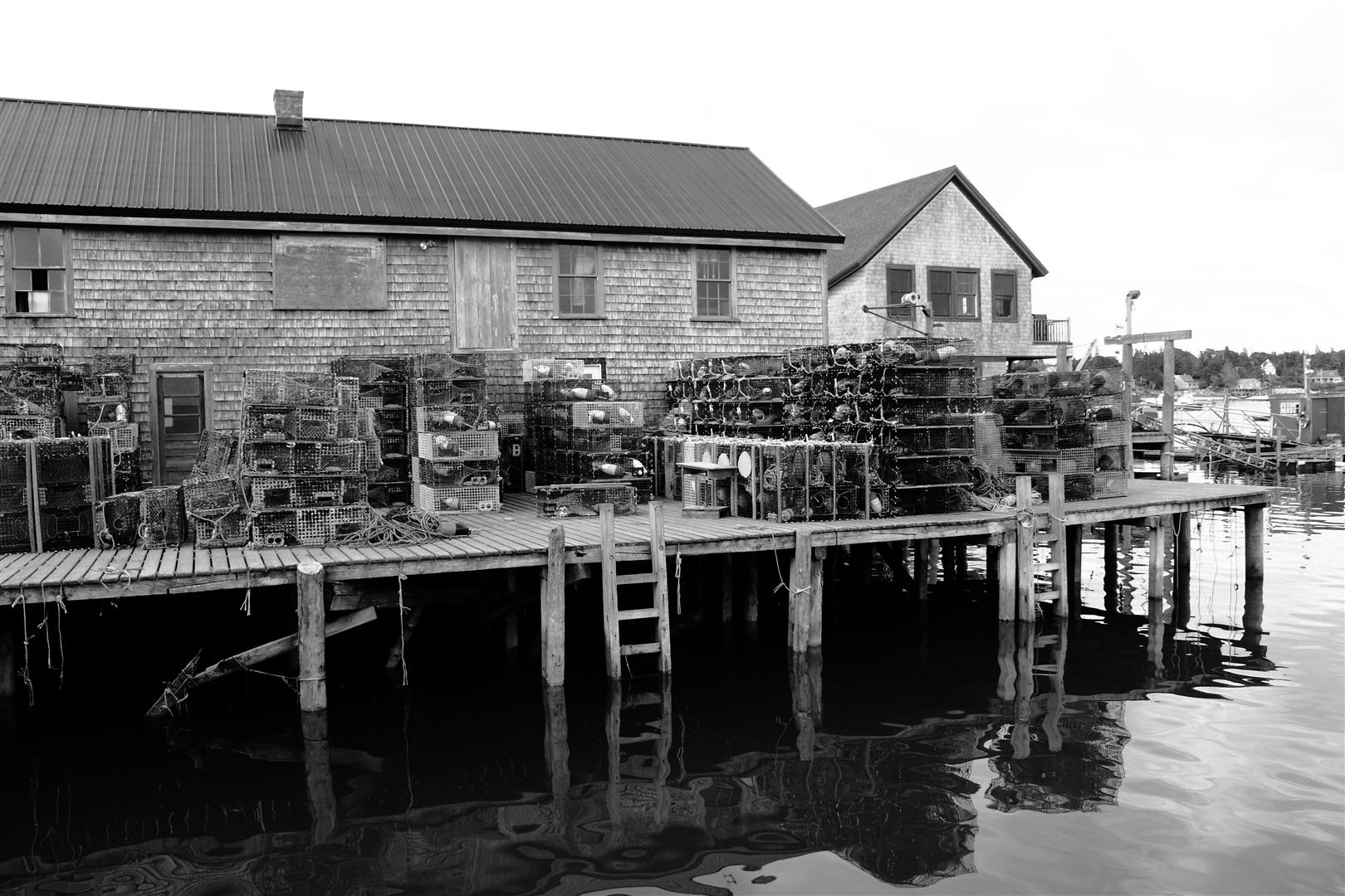
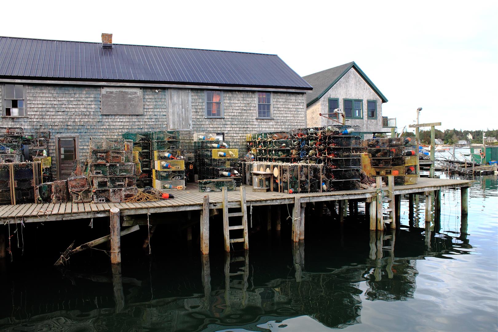
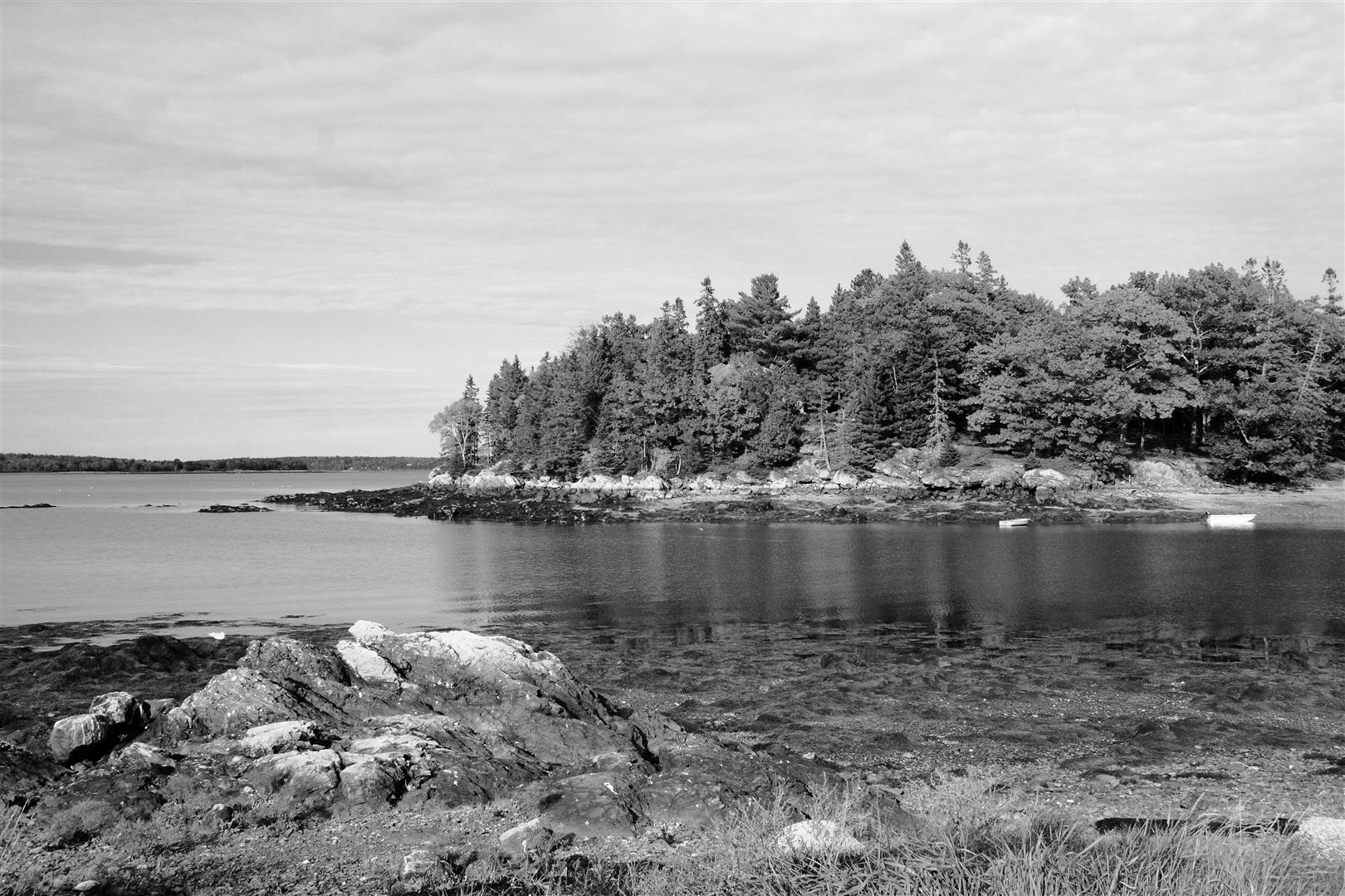
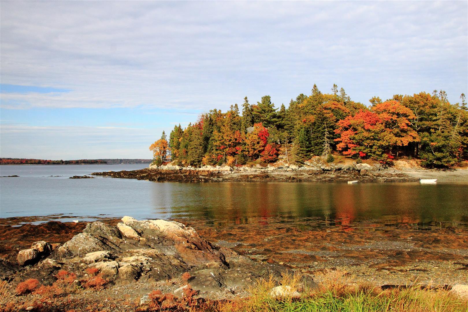
The question comes up often, would an image look better in black and white than it does in color. I can never always answer that because I usually wind up liking both, for different reasons, IF the black and white looks good. Sometimes I can easily pick one over the other, but many times not. Scenic shots in the Fall always look better to me because of the color. Old buildings may look better in black and white, especially if there is good contrast to begin with. Black and white does not do well for me if the shades are all gray, without DEEP blacks and BRIGHT whites. But, as with most art, beauty IS in the eye of the beholder.
|